
MEAL MATE
Food Ordering App
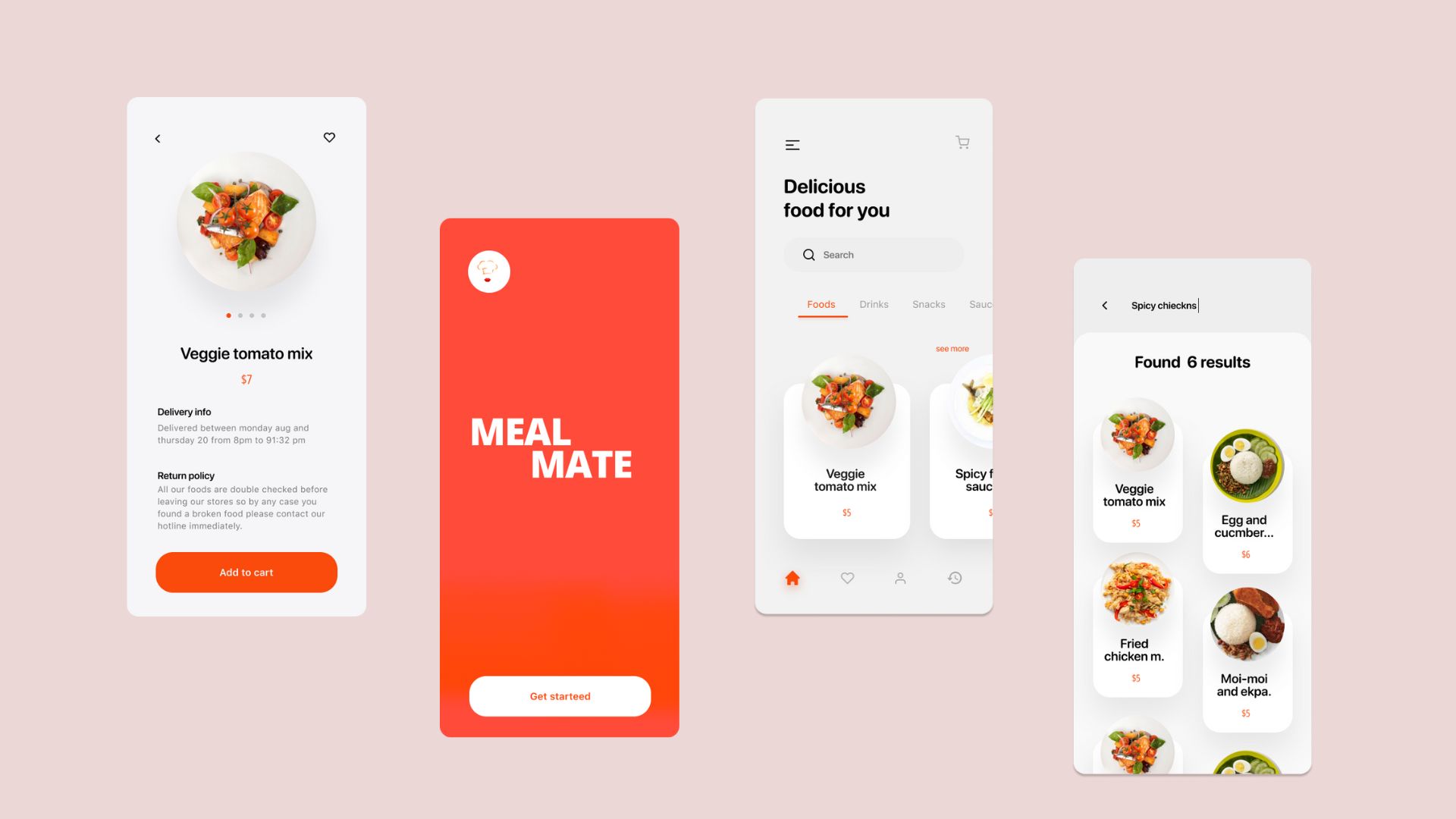
I used to design various things while I was in the process of getting to UI/UX design. One of the things I designed was a food delivery app called "Meal Mate". I used a brand identity concept I had previously thought of and created the layout using the limited UI/UX knowledge I had at the time. The app included four basic screens.
I decided to re-do a project I had previously worked on, focusing on the food industry, with more thorough research and the development of a complete app.
What does Meal Mate do?
Using the Meal Mate app, you can easily place an order for food and have it delivered to you quickly by simply using your smartphone. The platform allows you to start preparing your order as soon as you request it, providing convenience and ease when it comes to getting your food.
My Mission
Enhance the convenience and enjoyment of using food delivery apps by optimizing their functionality and design.
My Role - Design Process
- Attempting to gain a deeper understanding of the market through market analysis.
- Competitive analysis — trying competitor apps and reading app reviews.
- I conducted a survey online and received 20 responses.
- I conducted interviews with six users of food delivery apps in order to identify their challenges and difficulties. Four of these interviews were conducted in Rwanda, one in Kenya, and one in the US.
- I developed user profiles and used them to generate ideas for potential solutions through a brainstorming process.
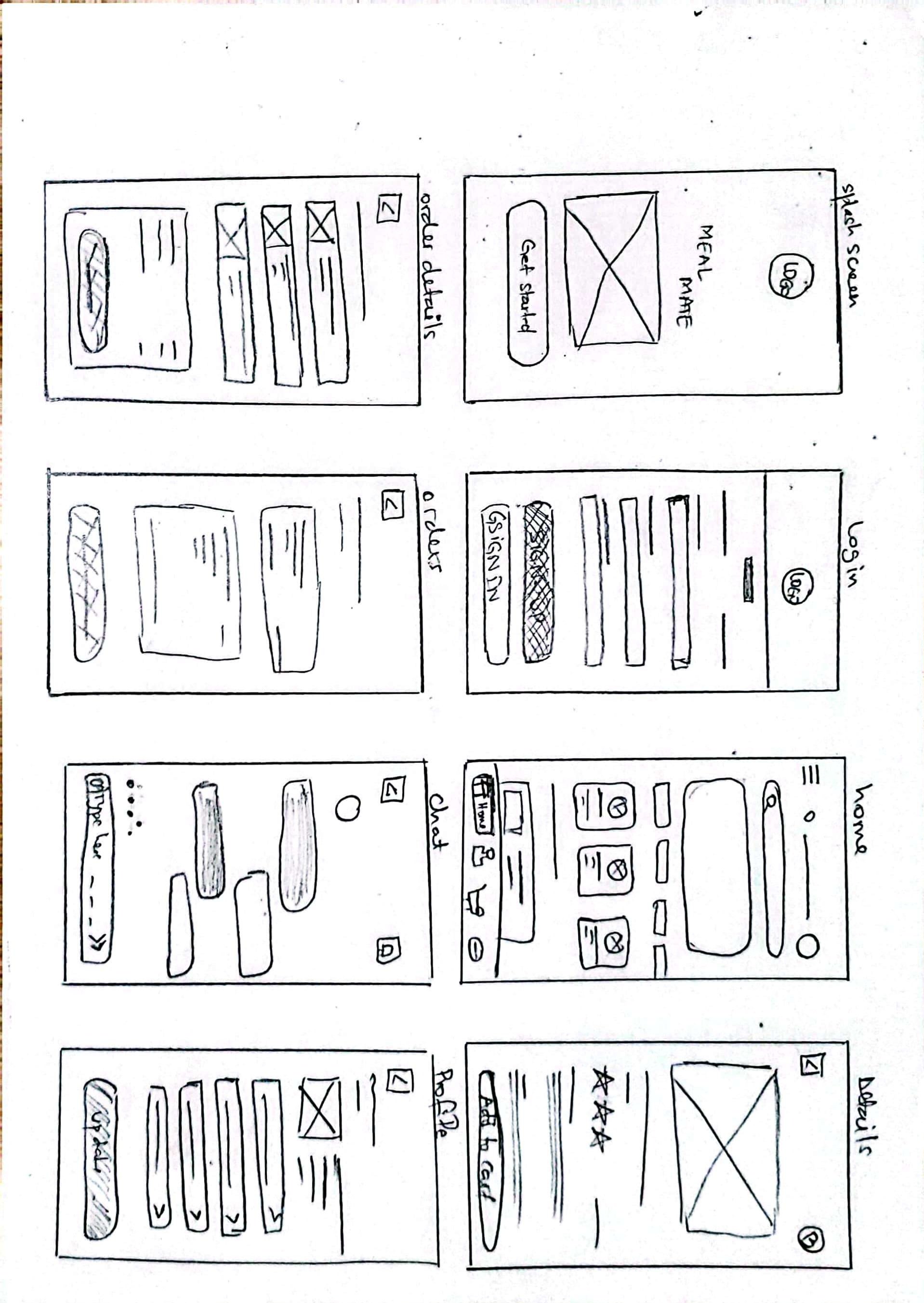
- I sketched the proposed layout of the app
- I created the user interface based on the sketches I drew, making numerous design alterations and removing unnecessary elements.
- I created prototypes.
Market analysis
In 2020, the global online food delivery market reached a value of $213 billion due to increasing disposable incomes and increasing internet access. The market is expected to continue growing in the forecast period of 2022-2027, with a CAGR of 14.5%, and is projected to reach $465 billion by 2026. This growth is due to technological advances in delivery methods and the increasing use of smart devices.
EMR's research found that mobile apps have the largest market share in the industry, while the order-focused food delivery system sector holds the largest share in the global market. Online payment is the leading payment method, with the major regional markets being North America, Europe, the Asia Pacific, Latin America, and the Middle East and Africa.
Source: Expert Market Research.
Comparative and competitive analysis
A competitive analysis involves studying your major competitors to learn more about their products, sales, and marketing strategies. It is a strategic way to gather information about your competition.
By conducting a competitive analysis, you can gain a thorough understanding of the strategies and practices of your competitors and identify areas where you can potentially outperform them.
“If you want to have the best-in-class user experience, you have to know what your competitors are doing. Learning their strengths, weaknesses, and what opportunities you have to gain market share can have a critical impact on the success of your business.” - Diff Agency
Here are some additional advantages of performing competitive analysis:
- It allows you to determine the unique value that your product offers and how it differs from similar products offered by competitors.
- It allows you to determine the successful strategies of your competitors, which is important for maintaining a strong presence and ensuring that your product and marketing efforts are superior to those of other businesses in your industry.
- Sharing information about what your competitors are lacking allows you to find opportunities in the market and try out new, unique features that have not yet been introduced.
- Learn through customer reviews what’s missing in a competitor’s product, and improve upon it.
- Gives you a standard to compare your progress against.
I tested various food delivery apps and highlighted the major competitors:
- Vuba Vuba
- McDonalds
- Java Food
- Pizza Planet
- Dominos
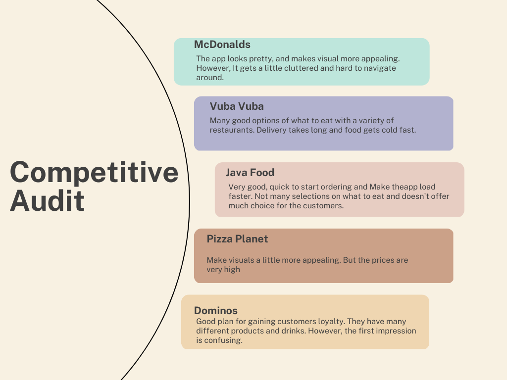
Take Away from competitive Audit
- Most food restaurants' websites and mobile apps usually show a picture of the food that has been ordered.
- Ensure that users can place orders with speed and efficiency.
- Provide a feature that allows users to save their preferred order or favorite items to order.
User research
I conducted two surveys, one using Surveymonkey and another using Google forms. I received a total of 22 responses. After collecting the results, I analyzed the data using multiple techniques.
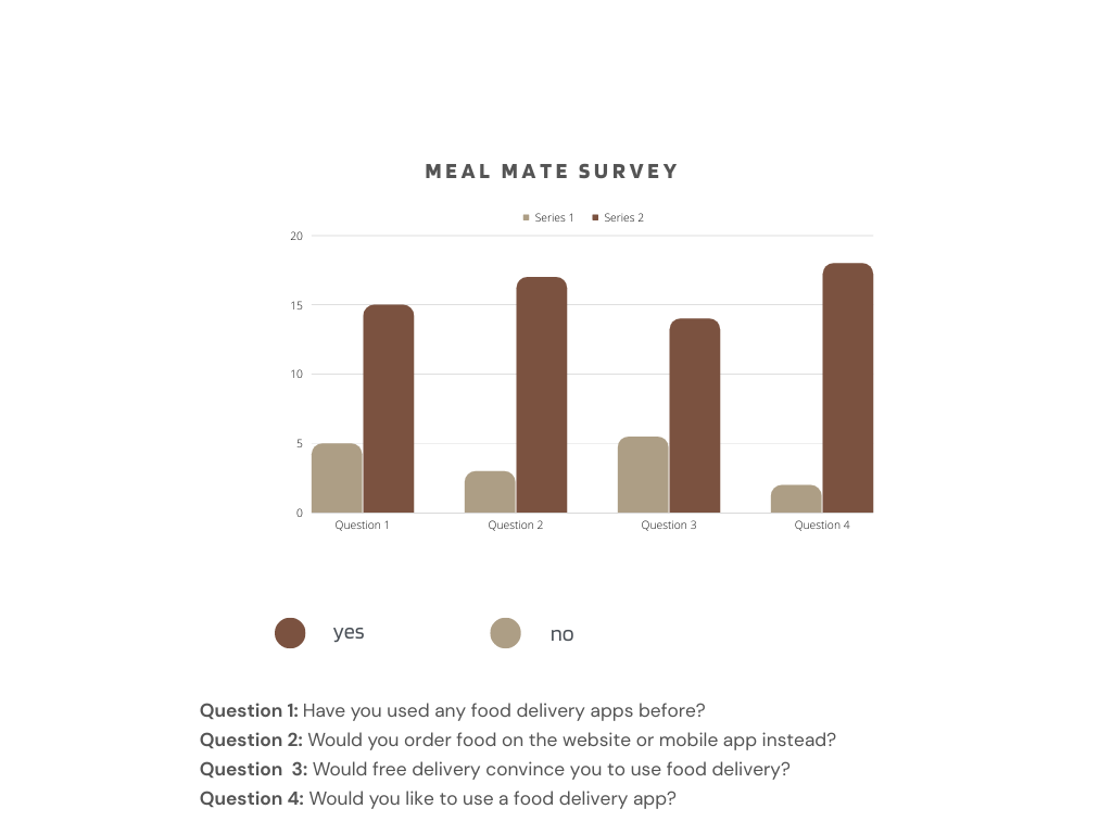
Most users prefer using a mobile app to place orders rather than using a website, according to the research.
Our findings showed that users were interested in purchasing food online, but had not yet used a food delivery app. This suggests that there is a gap between the desire to make a purchase and actually following through with it.
I was wondering how I could turn these passionate fans into potential customers. I brainstormed several ideas and ultimately decided to implement a straightforward onboarding process, clear and concise steps, organized information, a sleek design, and a sign in/sign up option that is only presented at the end of the purchasing process.
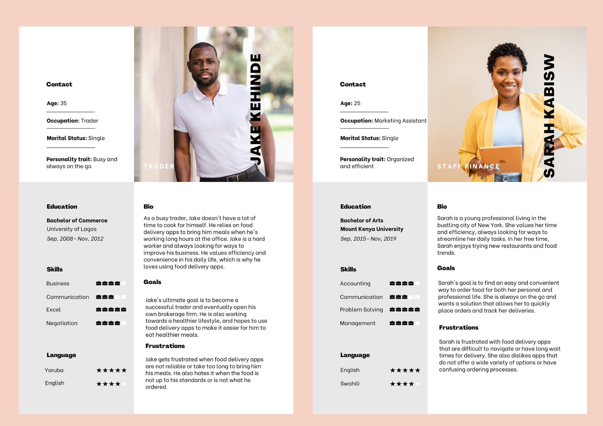
User personas
The user persona was created to represent the goals and actions of a hypothetical group of users, based on data gathered from interviews with real users and surveys.
Sketching
Sketching is an essential part of my design process that helps bring my ideas from my imagination to the screen where I can focus on creating a great user experience. It allows me to visualize how the app will function and interact between screens, making it easier to see and understand my concept in a tangible form. Additionally, sketching is a time-efficient method to avoid constantly starting from scratch on my design screens.
I created low-fidelity mockups to determine the general look of the app.
Challenges and how I solved them
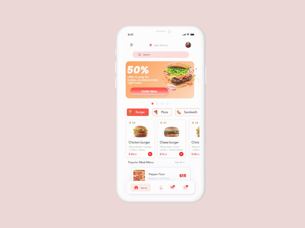
Home Screen
The Challenge
According to user research, new users do not spend a lot of time on the home screen after their first login, usually less than 30 seconds.
The Solution
- I used top-notch images to create a strong emotional connection to the app and a desire to satisfy the hunger.
- I arranged meals categories in the closest and top rated sections in a way that makes it easier for the user to decide what to order.
- The time for delivery is explicitly stated.
- I designed the page to be as simple as possible, using white space and proper color choices throughout the app.
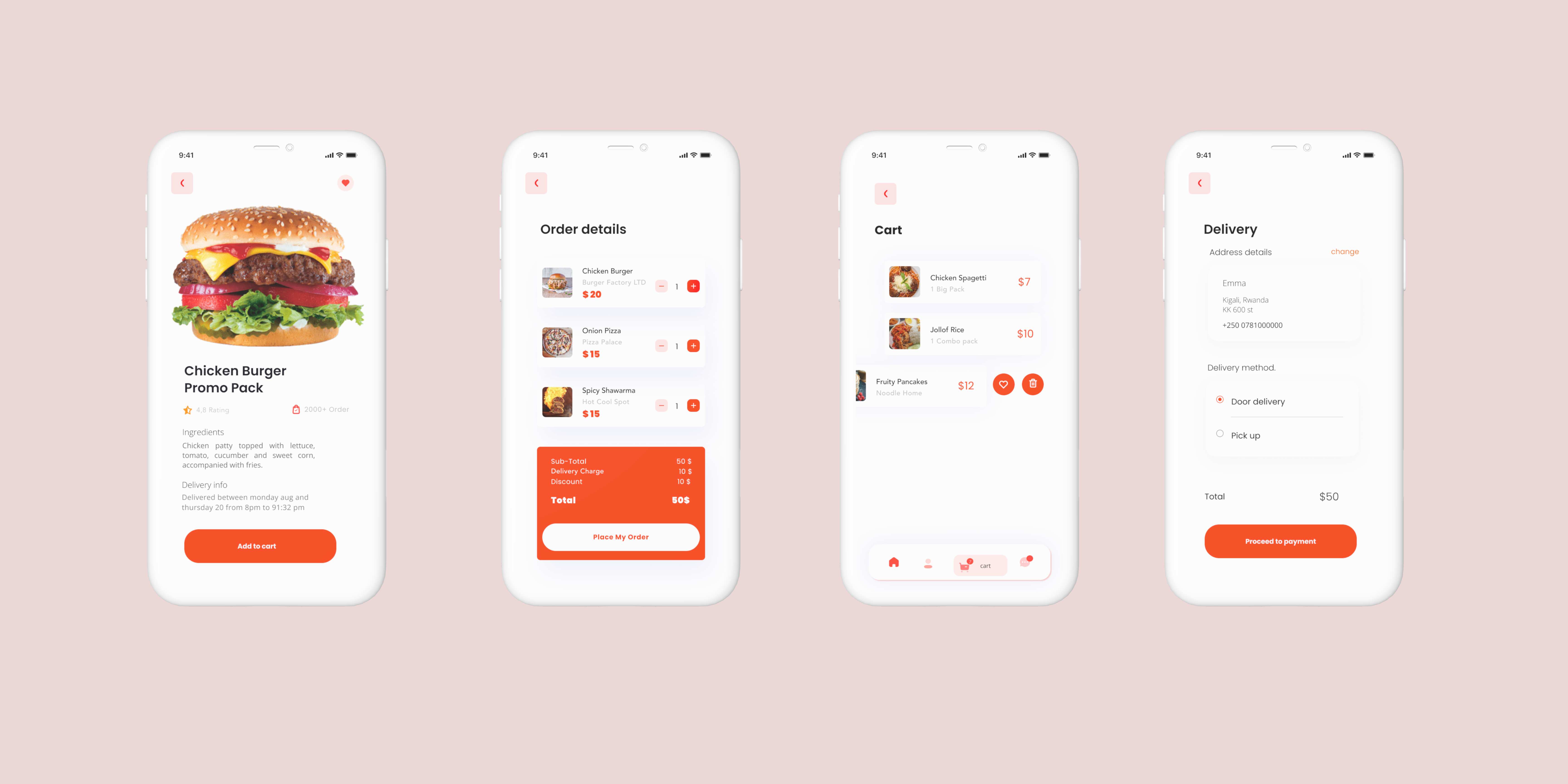
Order and cart
The Challenge
Some studies have found that some individuals who add items to their online shopping carts fail to complete the purchase process because the process involves too many steps and the cart is difficult to modify. Additionally, it can be challenging for users to make a decision on a particular meal if they have never tried it before, so I included a detailed description of each meal to assist with the decision-making process.
The Solution
- Before placing an order, a feature is included where the user can select any allergies they have so that the results will show meals that do not contain those allergens.
- The user has the option to contact the restaurant prior to placing an order to ask any questions they may have.
- All items are added in cart first and can be edited and a user can view meal details before adding it to cart.
- Once the order has been placed, quick navigation to cart is added and edit cart option is available.
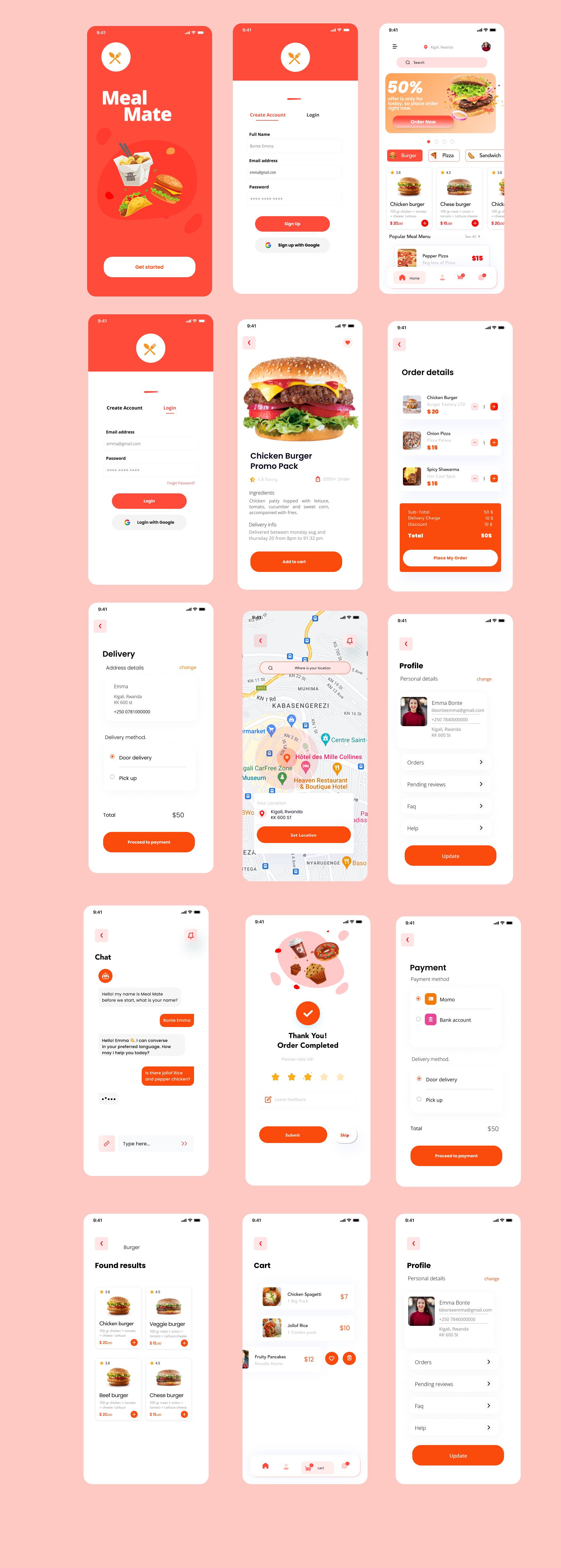
More screens
Takeaways
It's essential to consistently have a user-centered approach when designing. I realized this while working on my first UX project and understand that I still have room to improve. I also discovered the value of constantly revising projects to make them even better. I'm aware that there is a lot of potential for growth and I'm committed to improving my skills. As a Steelers fan, this quote sums up my perspective on the process of improvement.
"The journey is never ending. There's always gonna be growth, improvement, adversity; you just gotta take it all in and do what's right, continue to grow, continue to live in the moment." Antonio Brown
Next Steps
- I would conduct another usability test to determine if the changes made address the difficulties and frustrations experienced by the users.
- I would continue to improve the design by adding a promotion page and a fan page.
- Seek input from individuals or groups that have a vested interest in the situation to understand the challenges they are facing and to identify ways in which I can contribute to finding solutions.